7 reasons your interface designs look worse when they’re coded, and why it’s probably your fault

Mar 6, 2020

You spend weeks hearing about the Exciting New Website Project on the horizon. The project gets underway. UX research is done. A copywriter crafts perfect copy. Great photography is sourced. The team works on messaging, brand elements and project requirements.
Then it comes to interface design. The part you love. Where you get to use your design skills to craft perfect designs.
This is going to be incredible! The world will sing my praises!
Time to shine!
You sketch the interfaces then flesh them out in Figma. You work with stakeholders to address concerns. You run usability studies and iterate on the designs until you have confidence in them.
At some point, the design is approved. Awesome!

I am definitely putting this in my portfolio!
Handover
Now for the part you hate. Handing your finely tuned designs to the front end developer on the project. Let’s call her Olivia (not a real person).
Uggghhh, this is where it always goes downhill…

You email Olivia your designs. You’ve learnt from previous experiences that you should specify the font sizes and spacing. Maybe she can even extract some CSS from your Figma or Sketch prototypes.
Over to her now! She’ll get back to me if she has any questions.
You wait patiently for the designs to come back as a functioning website.
Hold on a minute
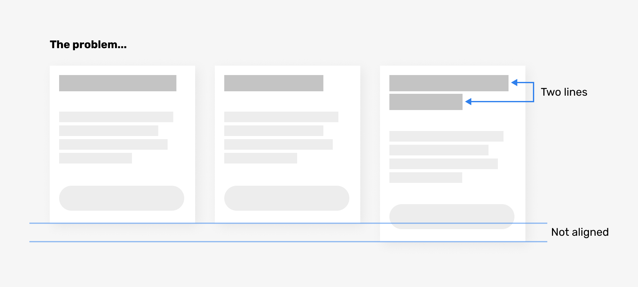
A few days later, Olivia sends you a link to the staging site. Your heart sinks. There are several issues you spot in the first 10 seconds of looking at it. And a bunch more when you look closer.

For some reason, Olivia has missed the mark. She made weird decisions about the tablet layout. The baseline grid isn’t working. The full-width images aren’t cropped properly. The cards don’t align horizontally. There aren’t any hover states. I could go on, but you get the idea.
Why does this always happen? There’s so many things wrong with it — it’s obvious!
You get slightly annoyed. Why does this always happen? Time to draft a long bullet-list email of changes. This email is clear and reasoned. You ask for specific changes and expect this one round of feedback is enough to address all the issues.
You hit send on the email and relax a little. At least it’s off your plate for a while.

Can’t you just fix it?
Olivia reads your version of War and Peace. She responds with follow-up questions to get clarification and provide the reasoning behind her decisions.
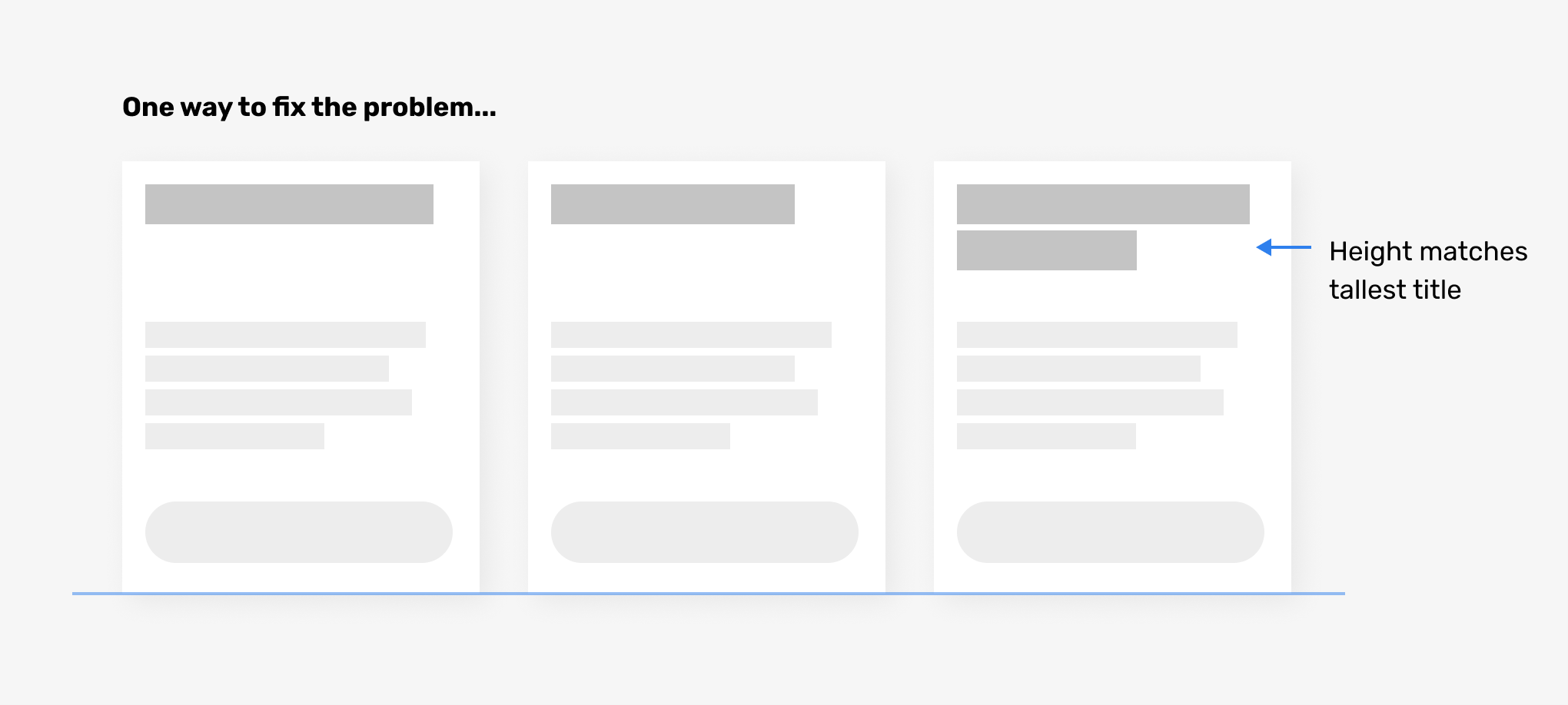
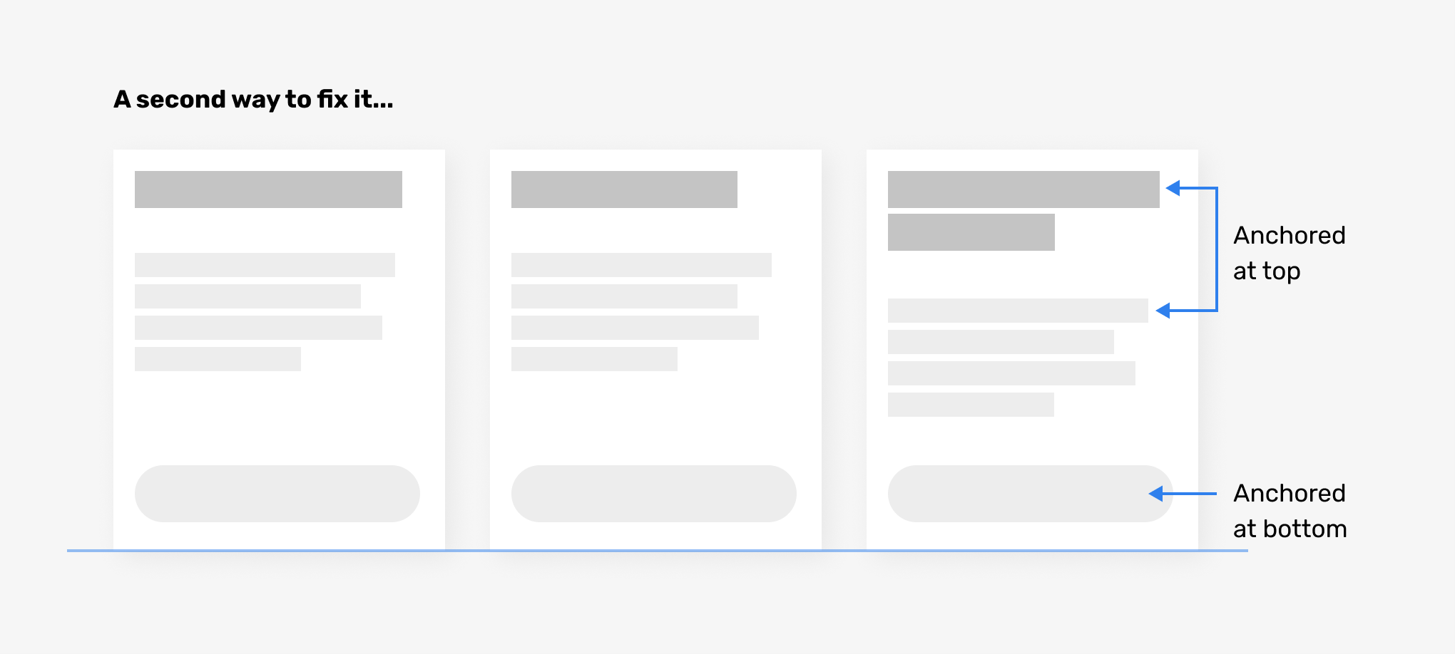
She explains why the cards don’t align horizontally. The titles can be anywhere from 6 characters to 143. This means that a title can be anywhere from 1–3 lines long, breaking the one-line titles shown in your design.
Olivia gives two suggestions for how to address the issue, but neither look as good as your original design.
You go back and forth and settle on one of the options. It’s always a compromise, right?
It’s not how I envisioned it, that’s for sure. I had it all lined up and looking perfect, but now everything’s kind of messed up.
Rinse and repeat for all the remaining issues. The site gets built in the end, but the result doesn’t look as good as your original design. You cringe at some parts of it and don’t want to show it in your portfolio.

That didn’t go so well. What’s next?
You move onto the next project without addressing it.
Maybe Olivia needed a more descriptive email when I sent her the designs? Then she’d know about all the little details. That’s what I’ll do next time.
Moving on is not addressing the issues. You can make this better.
I’ve seen this story play out many times. I’ve been on both sides of the fence as a designer who codes, so I know from experience where the issues can arise.
The real problem
In most cases like these, Olivia isn’t a problem. The designer is. And I say this as a designer who may have been that problem at times in my early days.
The good news is you can get a much better result if you learn more about the web platform, improve your craft and more clearly communicate with the developer.
It’s worth noting that, in my experience, cross-functional teams avoid many of these issues. Designers and devs working closely together at the same time makes for a smoother process. These issues seem to pop up more often in traditional agency waterfall processes.
7 reasons your interface designs look worse when they’re coded
1. You didn’t fully embrace responsiveness
You probably know what responsive design is. But knowing what it is and designing with it in mind don’t always go together.
Amy Schade describes responsive web design like this:
Responsive web design (RWD) is a web development approach that creates dynamic changes to the appearance of a website, depending on the screen size and orientation of the device being used to view it. RWD uses so-called breakpoints to determine how the layout of a site will appear: one design is used above a breakpoint and another design is applied below that breakpoint. The breakpoints are commonly based on the width of the browser.
When designing a responsive interface, you should consider at least three sizes: mobile, tablet and desktop. In reality, those three sizes don’t exist as exact pixel dimensions. Phones, tablets and desktops are all different sizes. Screensize.es lists devices sizes, and there are hundreds of them. So those three breakpoints are essentially used as a metaphor.
Can’t you just tell me what size to design things at?
So what should you do? Rather than think about what a design looks like at each breakpoint, you should think about at what point it “breaks”. Put another way, resize your artboard, and when it starts to look crappy or weird, you need a breakpoint to change the design at that size.
As a screen gets smaller, generally you need to stack elements on top of one another. A horizontal row with 6 items will need to stack vertically at a larger screen width than a row with 4 items. A row with 2 items might not ever need to stack, even on mobile.
Designing for several breakpoints might mean more design work than you are doing now. But the tradeoff is the more responsive decisions you make, the fewer guesses the developer needs to make.
Tips for designing responsively
- Design each interface at three breakpoints.
- The exact pixel sizes you choose to design at aren’t really important. Don’t stress if it’s a Google Pixel or an iPhone.
- Consider the widths where the design breaks, and design how to fix those breakages.
2. You designed a series of posters instead of a system
Developers work in systems and patterns. They see a heading 2 style and write some CSS that describes how a heading 2 should look across the site. But you’ve decided that the heading 2 on the home page is in uppercase. And the heading 2 in the sidebar has a border above it. These kinds of changes rely on context, and rules that you’ve defined internally, but probably haven’t communicated.
Designers who aren’t designing systematically for the web are essentially designing posters. Here’s a “home page” poster, and here’s a “contact page” poster. A poster is designed for one size, and isn’t connected to other posters.
A website is a connected, adaptable system. Your designs should simulate this as closely as possible.
There are great tools built into our design apps for designing systematically. The most common one is text styles. You define your text styles and apply them to all the text in your interfaces. Use these tools as much as you can. It makes your design work faster as you make changes, and makes it easier to generate a pattern library or design system for developer handoff.
Tips for designing more systematically
- Create a text style for every piece of text on your site/app. Yes, every piece of text.
- Create a pattern library. This can be as simple as one long page that includes a shopping list of every type of element in use on your site. All text styles, image styles, form elements, buttons and all other design elements should be included. This is critical for showing the developer the systematic design decisions you made.
- Be aware that each time you nudge an item a few pixels from where it should sit according to its styling rules, you are creating a new variation that needs to be communicated to the developer. This applies to any other one-off styling changes that fall outside the system.
Further reading
- Design Systems vs. Pattern Libraries vs. Style Guides — What’s the Difference? by Zack Rutherford
- How to create a pattern library and why you should bother by Paul Boag
3. You didn’t design all the states needed for interactive elements
You designed a button. Maybe you also designed a secondary button style. But did you design each of those buttons in their various states?
A button should have the following states:
- Default: what it looks like in its normal state. Hint, it should look like a button 😁
- Focus: For when the button is selected via keyboard navigation. Without it, navigation via keyboards or other directional input devices is almost impossible.
- Disabled: When the button cannot be interacted with. For example, if the action cannot be taken at this time.
- Hover: When the mouse is hovering over the button.
- Active: When the mouse is currently clicking on the button.
Wow, that’s a lot, right? Yep, and each time you add a new button style, you need to account for each of those states. And that’s only for buttons. All interactive elements contain states which need to be designed by someone. Might as well be you!
Think of a tabbed section. The tab navigation should have default, active, hover and focus states. These states should be communicated to the developer. This is generally done via the pattern library or an interactive prototype.
Tips for designing and communicating states
- Design each state of your interactive elements for ease of use, clarity and accessibility.
- Communicate the design of each state of an element outside the context of your page layouts. Use a pattern library to communicate the states.
4. You don’t understand how sizing on the web works
Most web pages these days are full width on mobile. As the screen gets larger, the designer makes decisions about how the page will react. The most common convention is to place the website in the centre of the screen at larger sizes. If you decide to do this, you need to determine the maximum width of the interface. This is the only width that matters. On smaller screens, you get the 100% width.
A grid is another area where I have seen confusion. 12 column grids are common because they allow for good subdivisions (e.g. you can have 2, 3, 4, 6 items spread evenly across columns). The space between each column is called the gutter. The gutter can be fixed (e.g. 20px), or proportional (2%). Each will behave quite differently at different screen sizes.
Design tools such as Sketch and Figma force us to choose set sizes for elements. They don’t allow us to truly design responsively for proportionally-sized elements, despite them having tools for quick resizing based on the canvas/frame width.
What does this mean for you? Well, do you want that 400px wide box to scale proportionally with the page, or remain at 400px wide at all times? Maybe it’s 300px wide on small screens, or maybe it’s always 50% of the available space, allowing for two items across a row. You should know the tradeoffs of these decisions, and be able to communicate these decisions to the developer.
It’s also useful to understand the various sizing units available to developers. Many designers aren’t aware of viewport units.
They are truly responsive length units in the sense that their value changes every time the browser resizes — CSS Viewport Units: A Quick Start
Viewport units are great for creating full-height sections. Think of those sites where you have a long page, and each section is 100% the height of the browser. That’s viewport units at work. Sitepoint has a good article on viewport units if you’re interested in reading more, although it’s aimed at front-end developers.
Commonly-used sizing units are pixels, ems, rems, and percentages. However, you can also use points, mm, cm and others, but these have more limited use than the commonly used units.
Tips for sizing on the web
- For each element you place in the interface, you should know whether it’s a proportionally sized or fixed size.
- Communicate to the developer how each element should scale as the browser size changes.
- Learn what sizing units are available, and specify those units to the developer when you’re expecting the behaviour to respond to the browser size.
5. You lack the vocabulary or knowledge to explain your ideas
Perhaps your designs are well-considered, but you struggle to communicate to the developer how something is intended to work. If this is the case, it’s most likely your lack of domain vocabulary or knowledge holding you back. You aren’t on the same wavelength as the developer.
Here are a few things all designers working on the web should have an understanding of:
- HTML element names, especially form controls
- Techniques such as infinite scrolling, client-side rendering, server-side rendering, AJAX calls
- Form validation and how to communicate errors to users
- Accessibility concerns as they relate to your designs
- What server-side and client-side rendering is
- Basic CMS editing, so you understand how the end-users will be creating content
- Resolution and pixel density for various screens
- How images are rendered on the web (e.g. bitmap vs vector)
You don’t need to become a front-end developer to be a good interface designer. But it helps to gain empathy for their role just like you gain empathy for your users.
Tips for learning the language of the web
- Learn the terminology, elements and concepts of the web. This will help you communicate with developers and be a more well-rounded designer.
- CSS Tricks has a good article that covers many terms that a designer should know.
- Smashing Magazine is a treasure-trove for all skill levels learning about web design and front-end development.
6. You didn’t allow for variable content
When I described the issue of Olivia not nailing the horizontal alignment of a row of blocks, I touched on an issue I see regularly. Designers not catering for variable content. This creates disappointment when they see the design in a real-world situation.
The beautiful dashboards on Dribbble with fake data are fun to look at. But don’t confuse these artworks with real, functional designs that rely on real data from a database.
Here’s some variable-content issues you may see:
- Text blocks vary in length, breaking the horizontal alignment of elements.
- Your layout has three items, but there’s four items to display.
- Most blog posts have a featured image, but there are a few that don’t.
- An item in a list needs to display a piece of data which other list items don’t.
- You want to truncate some text with an ellipse, but the information is too important to hide.
- You have no, or limited, data to show.
- A very long word which doesn’t hyphenate breaks out of its container.
So how do we pressure-test our designs so they adapt to variable content? If you’re dealing with a CMS, you need to know if the fields of data your interface displays have restrictions on them, and what type of content they are. Let’s say you have a title — does it have a maximum number of characters? If so, great, use that number of characters in your design.
What if there are no restrictions on the number of characters? If you’re dealing with an existing system, you can look into the database to see the shortest, longest and average titles.
If you don’t have that data available, design for a very short title and a very long title. Then optimize for an average length one.
Tips for dealing with variable content in your designs:
- Pressure test your designs with variable content. Break them. Then design ways to fix the breakages.
- Use real data to measure the number, length and frequency of content you are designing for.
7. You didn’t ask enough questions
You might think you don’t need to ask questions to the developer. After all, it’s up to the developer to ask their questions to get what they need.
Don’t do that. You’re missing out on the opportunity for a person with a complementary skill set to contribute. Here’s a few things you should be asking a developer.
Questions for before you start working on the design
- Will you be available for a handover meeting and perhaps a follow-up?
- Are there any technical limitations I should be aware of?
- Do you want to see our UX research, user flows or any other documentation aside from the design files and spec?
- I plan on creating all designs at three breakpoints (portrait mobile, landscape tablet, desktop). Does this work for you?
- Is the suggested format suitable (e.g. Figma)? Can you extract what you need from my files?
- Are SVG for vector, and JPEG/PNG at 2X suitable for assets?
- Is copy supplied in Google Docs suitable for you?
- Do you prefer annotated designs or prototypes for micro-interactions and animations?
- How should we address new insights that affect design once you’ve started work?
- How do you prefer to communicate? Slack, email, commenting system in Figma, phone?
Questions for during the design stage
- Are there any potential issues you see with the design, or opportunities for improvement?
- Have I proposed anything that might slow the site down?
- Have I proposed anything that falls outside the scope of the project from your perspective?
- Are you confused about the purpose of any of the interfaces? (a chance for usability testing!)
Questions upon completion of the project
- Is there anything we can improve for the next project?
- Are there better tools for communication or collaboration we should try?
Further reading
Here are a couple of good articles that describe an ideal developer handoff:
- Developer handoff for designers from Abstract.
- Design handoff guide by Katica Babarczi
Closing thoughts
Fixing handoff issues will result in faster and more rewarding collaboration with developers and result in a better outcome for the project. It boils down to the designer learning more about the web platform, improving their craft and more clearly communicating with the developer.